Practices


Materials
- Acrylic paint can't be combined with other colors once it's dry, so when it comes to color gradation, I need to apply the color as soon as possible before it dries.
- advantage of acrylic paint is that once it's dried, it can't blend with other paints. So, if I use the wrong color, or need to re-color, just wait until the color is dry and then re-color to cover it.
- Due to the particularity of the texture of acrylic paint, I had to apply the color as soon as possible before the paint was dry.
- I want to use acrylic paint completely in the whole process, instead of adding other pigments to assist the work. However, due to the special properties of acrylic paint, I need repeated practice and deliberation to make a good sculpture.
Improvements To My Skills
- First time that acrylic paint and quartzs and are used as pigments to paint.
- The texture of acrylic paint is different from the transparent watercolor used in the past
- Wanted to create a painting with many kinds of colors.
- Practiced repeatedly in color matching.
- Acrylic paints are very opaque.
- No way to stack them to achieve the purpose of color mixing.
- The first time to create three-dimensional works on the plane painting.
- In the past, plasticine and iron wire are frequently used to make 3D works.
- Needed to pay more attention to the construction of this sculpture.
Challenges Of Assignment
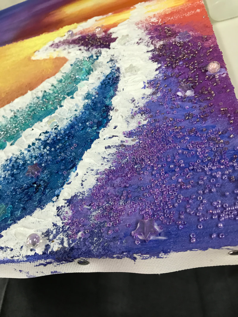
- Most challenging is how to turn a floor plan into a three-dimensional because when painting on paper, I need to use some three-dimensional objects to add to highlight my painting and achieve a three-dimensional sense.
- How to make the whole work with a sense of hierarchy and three-dimensional needs careful consideration and innovation.
Photos When Making
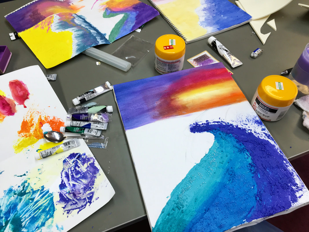
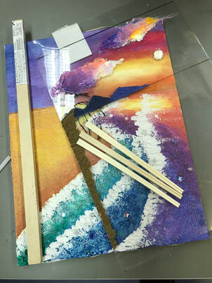
|
|
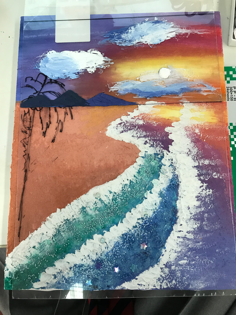
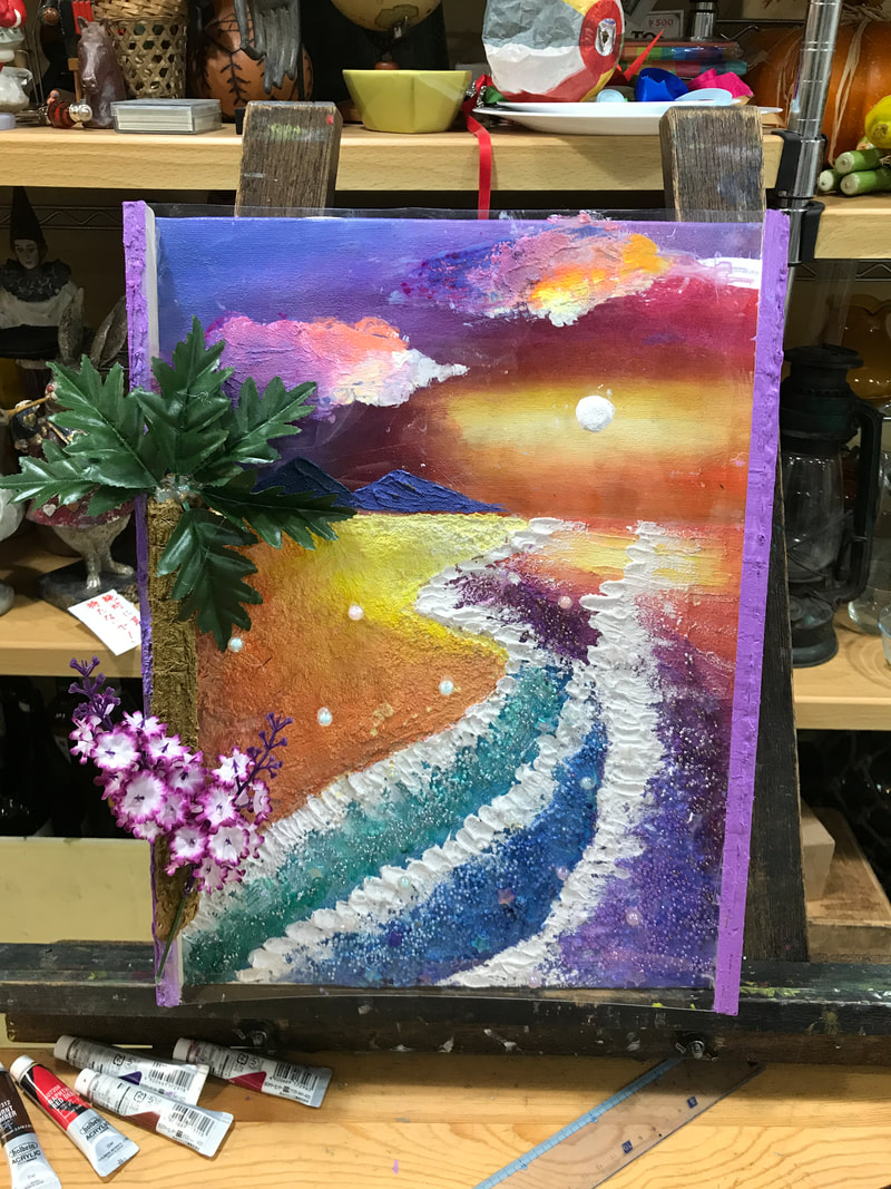
|
Creative Decisions
- To use a lot of colors throughout the sculpture.
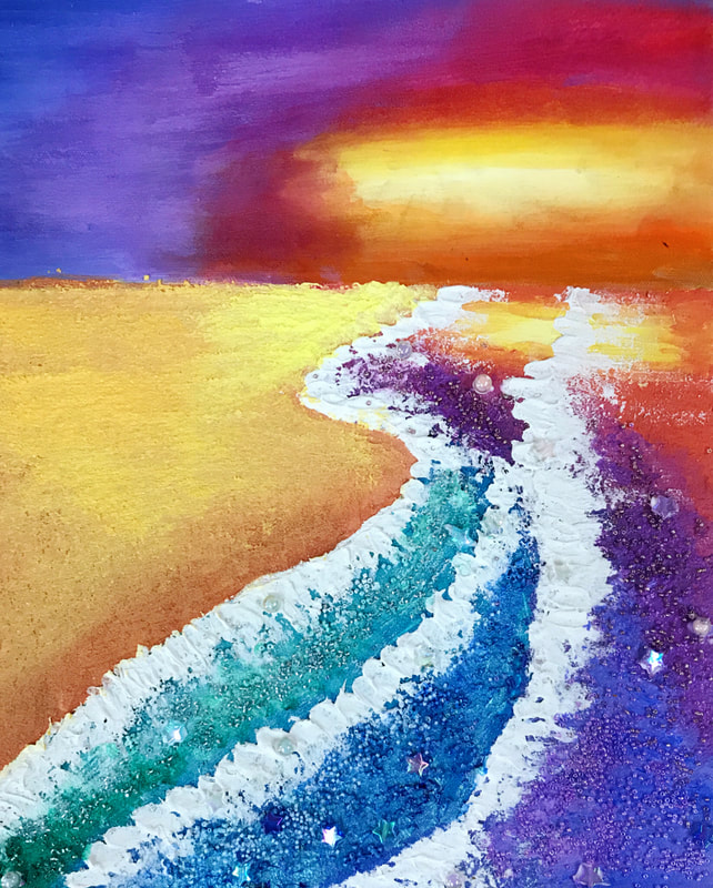
- Intention of the creation is to express the happiness of browsing the beautiful scenery and the happiness of being with family, the whole work mainly used light colors instead of dark colors, to create a kind of dreamlike feeling.
- To make the whole work more prominent, a variety of colors are used to create a pleasant, dreamy feeling.
- Pay attention to the use of color gradient, such as in the color of the sunset. For example, according to the natural situation, the sunset reflected on the sea surface should also have the corresponding color.
- The colors of the ocean and beach slowly get darker as the scene moves further away from the setting sun.
Mood: Dreamy
My inspiration for this work came from a trip to Okinawa with my family. I swam at the resort hotel and lay on a lounge chair by the sea. Perhaps, there was no pollution as the seawater of Ishigaki Island was aqua, and it became more colorful under the setting sun, which was dreamy and natural. The trees and tropical flowers surrounded me. I want people to see this work and experience the happiness I felt at that time, so there was no mixing with black when I colored. Instead, many colors were added, with some white, making the shades lighter and gentler. To reflect the sunset, I transitioned from warm colors to colder colors. In the end, tiny beads sprinkle the sea, and it has a more dreamy layering.